House with an Atrium for IndesignLive
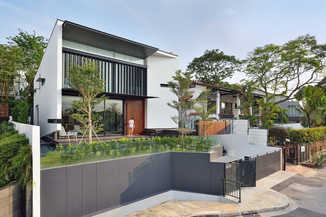
In a quiet Queenstown neighbourhood, a family house by RT+Q Architects defies the disadvantages of its site and poses creative solutions to bring light and air into its interior spaces.
It is not an easy accomplishment to design a house that retains a façade of privacy on its public-facing exterior, yet feels bright, inviting and filled with natural light behind its public face. Yet, it is a spatial juxtaposition that appears as a natural solution within the aptly named House with an Atrium by RT+Q Architects, which has designed the residence to make the maximum use of its site and to respond to the owners’ programmatic requirements.
From the very beginning, the clients – a couple with three children – expressed their desire for a design that would allow plenty of daylight into the interiors of their house. A challenging task for a site situated on a North-South facing plot of land and sandwiched between two other residential properties. The configuration of the rectangular plot also hindered the design team at RT+Q from designing big openings at the East- and West-facing façades. As a solution, the team chose to design a house with a large, double-volume atrium that pierced the first and second levels of the residence, bringing in light and air without attracting too much heat from the afternoon sun.
“One feature of a lot of our buildings is that their front façades do not give too much away but, internally, the houses still feel very open,” says Rene Tan, Director of RT+Q Architects, highlighting the recurring theme within a lot of firm’s projects. Within the House with an Atrium, too, the titular central void is instrumental in creating a sense of openness and space from the inside.
With the courtyard and its two-storey high green wall, the configuration of the communal spaces around the inviting atrium became a logical choice. On the first floor, the design team positioned the gallery and the dining area directly across from each other, providing expansive, unobstructed views of activities taking place at the opposite, East and West ends of the house, while placing a spacious living room at the front of the house facing out to the vibrant green wall. On the second floor, the team designed a master suite overlooking the atrium’s courtyard and the spaces below, giving the clients a broad overview of the entire house from the comfort of their room. Other bedrooms were given more privacy by being set back from the atrium via elongated circulation spaces around the internal courtyard.
In a similar, strategic move, the RT+Q team incorporated open light courts and glass floors above selected areas of the basement to bring natural light below ground and make the lobby, tuition and entertainment areas, as well as various service spaces, a welcoming, well-lit continuation of the family spaces above. The choice of materials, like light grey concrete and marble throughout the basement and upper floors, further enabled the team to create a sense of space and openness within the 7,700 square foot home.
The team took special delight in designing the first-storey staircase, which was crafted in the same spirit of bringing lightness and various transparencies into the dwelling. “The owners were adventurous enough to go with a different kind of staircase,” says project lead Allan Tongol. “As a result, we went with perforated steel as a chosen material for the treads and the rises, making the whole structure, just like the house itself, look transparent and light.”
Tradition and Inclusivity in Balance for IndesignLive
For the Singapore Chinese Cultural Centre, DP Architects merge traditional Chinese influences with a forward-thinking design vision to create a venue that fosters socio-cultural interactions.
As a new cultural landmark complementing the neighbouring Singapore Conference Hall in the central business district, the Singapore Chinese Cultural Centre (SCCC) is a thoughtful amalgamation of functional and educational spaces with an expansive programme driven by innovation and anchored in culture and arts.
Designed by DP Architects with landscape consultant DP Green, the new building is the answer to a design brief that called for a forward-looking, and spatially and socially inclusive building that would create a welcoming destination for diverse groups of visitors.
The new venue walks a fine line between fitting in with its surrounding context and standing out. The SCCC is a one-stop destination for performances, exhibitions and cultural activities. To bring coherence to the composition of programmes held within, DP Architects gave the building a clean and contemporary look that also connects to the neighbourhood around it.
DP took inspiration from traditional Chinese three-tiered architectural compositions, and organised the SCCC in a functional stack for clarity of programmes, circulation and planning. Articulation of the architectural language reveals itself in three distinctly defined tiers: an elevated base that offers public spaces below, a solid body that contains all the main functions, and a glass crown for performances and cultural activities.
The DP team also drew inspiration from traditional Chinese landscape art to conceptualise the SCCC building and connect it to the setting around it. “The landscape is usually expressed with rough strokes (皴 in Chinese) to outline the coarse nature, while the building is depicted with more refined representations,” recalls Wang Ying, Associate Director, DP Architects. Likewise, in the SCCC, the juxtapositions exist between the box form and the multi-faceted podium, between the transparent top and the opaque bottom, and between the smooth crown and textured base. The juxtapositions create a balanced dialogue, echoing the artistic sensibilities found in Chinese landscape paintings.
As a result, the subtle implementation of Chinese architectural and artistic influences and the clean, contemporary expression of these ideas in the final design allows the SCCC to serve as a beacon of cultural identity and heritage, while remaining harmonious and inclusive of broader communities. According to Ying, “The mix of contemporary ideas in the facade treatment and traditional architectural convention in the planning embodies the spirit of respect. The architecture remains true to Chinese culture and heritage while becoming a conduit for interactions from various socio-cultural elements.”
A Hub for Creative Collisions for IndesignLive
Asylum designs a co-working environment suited for innovators from all industries.
Co-working has become a preferred way of working for many companies and start-ups, thanks to its offering of workplace flexibility and networking opportunities. With the recent spurt of co-working hubs all around Singapore, businesses looking for a workspace to suit their needs are in no shortage of options.
Collision 8 is one of the latest co-working spaces to open here, and is the brainchild of Michelle Yong, head of Aurum Land, the property development arm of construction conglomerate Woh Hup, and John Tan, serial entrepreneur and partner at two micro venture capital funds. With this project, Yong and Tan have envisioned a cross-industry collaborative environment supported by a community building programme to facilitate collisions fundamental to the growth of innovative businesses.
For Yong and Tan, the biggest distinction between Collision 8 and other co-working spaces is the focus on the community and the notion of ‘collisions’, beyond just the space. Says Yong, “By engineering serendipity through member curation and monthly personalised introductions by our dedicated community manager, we are uniquely placed to foster high value connections between our members, something that typical co-working spaces do not offer.”
With a determination to cultivate a communal spirit within Collision 8, Yong and Tan enlisted creative design agency Asylum to materialise the main objective of creating an aspirational and sophisticated, yet playful and energetic workspace, through spatial planning and interior design. As the co-founders’ design brief called for a series of spaces that exuded exclusivity, yet allowed for opportunities for members to mingle, gather and exchange ideas, Asylum aimed to provide a range of public and private areas that invited different modes of interaction.
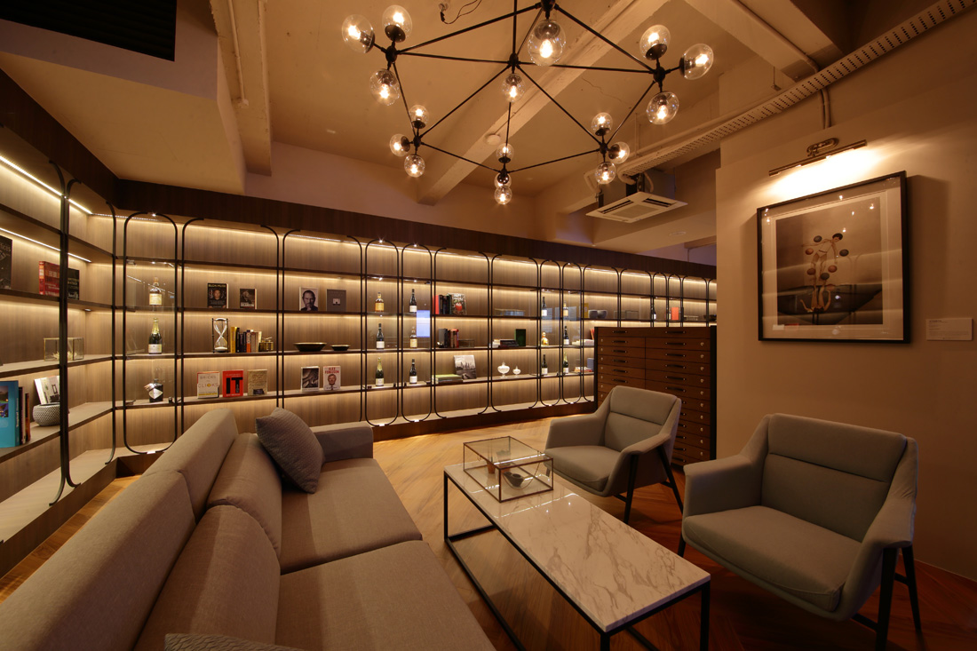
The Asylum team paid particular attention to the public spaces, from the warmly lit library lined with glass cabinets displaying a personal collection of spirits, to the adjacent bar and lounge area, all set against a panoramic backdrop of the Marina Bay Sands, Boat Quay and Fort Canning Park. “We wanted the ‘heart’ of the space to be highly energetic, a space where members could mingle, gather and exchange ideas,” says Cara Ang, design director of Asylum. “What better way to have a nice conversation than over a cup of coffee or a good whisky? Elements such as a library lounge, a bar and a reception area, designed with the intention to heighten the exclusive atmosphere of Collision 8, fell into place, setting the ideal backdrop for social interaction.”
To accommodate a variety of working styles for the tenants, the Asylum team planned for an assortment of work settings, ranging from private offices to hot desks, breakout spaces and meeting rooms. Depending on the nature of the working environment (private, semi-private, highly collaborative), the team varied the design aesthetic from more traditional within private offices to more playful in the meeting areas. Within the breakout spaces, the Asylum team created a lively atmosphere facilitated by the use of bold textures and elements that reinforced the vibrant brand identity. Elsewhere, the team mixed fun and sophisticated elements, functional details and unexpected design features to spark the imagination of Collision 8’s tenants.
“We believe that in the right environment, collisions happen naturally. Nonetheless, we have filled the space with quirky surprises intended to spark curiosity, creativity and conversations at every turn, including fighting fish in the toilets, a mini urban aquaponics farm in the gallery area and a hall of fame, among others,” says Yong.
Having officially opened its doors on 1 August, Collision 8 aims to accommodate approximately 175 people within its 8,600-square-foot space. It already has 450 individuals as part of its growing community, and the goal to grow the membership into the thousands.
“We’ve created a space specific to the business needs of innovative, collaborative companies and individuals looking to take their business to the next level,” concludes Yong. “We believe that innovation will disrupt every industry and is key to building the next generation of successful businesses.”
Charming Chinoiserie for Prestige Global Designs
Within the public and private areas of a home, Chinoiserie décor elements can make spaces come alive with opulent colours and patterns. In a dining area, a majestic feature wall framed by slim slivers of light brings focus to the space and serves as an elegant art piece that complements the stately dinner table and chairs. Likewise, Chinoiserie-inspired patterns add a touch of sophistication to the cabinetry and furniture pieces and provide a statement-making backdrop to a small seating area.
In a bedroom, the colour selection for Chinoiserie-inspired pieces can soothe the eye with a softer palette and delicate detail work. The use of gilded gold for a frame above a bed’s headboard and in slimmer profiles of the framed mirrors instantly adds a luxuriously composed feel to the space.
Ornamental treatments that are signature to the Chinoiserie style do not have to be confined to wallpaper and panel treatments. Creative implementation and mixture of bold and delicate patterns within the living room space pull the furniture arrangement together into one cohesive area. Elsewhere, ceiling and wall framing techniques that recall aspects of traditional Chinese architecture add visual depth and highlight the difference in ceiling heights in a lofty Singapore residence.
Subtlety comes a long way when designing a home in a contemporary Chinoiserie style. Discreet interior decor touches can add interest to a space without making it look cluttered or busy for a clean and composed look. The delicate trellis-like feature with strong, rhythmic pattern cutouts above the bed’s headboard provides a perfect alternative for an artwork to enhance an otherwise unadorned wall. Selected upholstery, soft cushions and bedding bring further harmony to the room, tying it together cohesively with the strategic use of gold and black accent colours.
Updating the Classics for Prestige Global
A well-executed contemporary classical design approach in residential applications goes beyond combining fine architectural details and sophisticated furnishings with clean-lined geometries and bold shapes and assesses how well these elements come together and how they can complement each other within a space. The result is elegant and enduring; a design that is neither trendy nor outdated in its approach.
With the notion that tradition and modernity can coexist, three homes’ interiors exemplify the refined appeal that a contemporary classical style can bring to a dwelling. Defined by a combination of distinctly classical interior proportions with timeless geometric shapes and warm brown and neutral colour palettes, one unit in a cluster house development and two condominium apartments offer inspired examples of spaces that transcend the typecasts of any specific time periods.
An impactful yet inviting living room delivers a balance in creating a striking first impression with its formal seating arrangement and distinctly classical proportions and in setting up a welcoming living space with the use of warm brown tones and accent lighting. Neutral lines and bold prints on the carpet and fixtures enliven the space, while the unique organic cluster of pendant lamps anchors the overall composition together.
In the dining room of this unit, the colour palette is deliberately muted, immediately enhancing the presence of the stately, classical proportions of the wall panelling that, in turn, frame the display of photographic works on each wall. The classical dining table and chairs are the central masterpieces of the room, setting up a reciprocal dialog with the decisively contemporary lamp that hangs in place of a typical chandelier.
Beadings and treatment of the walls in the bedroom continue the classical language introduced in the dining room. Strong linear geometry asserts itself in the bedhead behind the plush bed cushions but is softened by the unobtrusive brown and neutral colours used throughout the room. A statement piece – a leather wingback chair in deep blue – draws the gaze to itself and neutralises the earthy shades that dominate the rest of the bedroom.
A corridor at this condominium unit proves that it, too, can be more than a simple transitional space. As with the rest of the spaces within the unit, where the design capitalises on simple, clean lines to create some pleasing spatial arrangements, the corridor takes on a captivating identity of its own, where strong geometry and symmetry govern and guide through the space. Contemporary artworks and picture lamps, along with the directional cove lighting above, remind of a formal art gallery display, while the brown and beige tones remain pleasant to the eye in their contrasting colour pairings.
Bringing Comfort to Luxury for Prestige Global Designs Blog
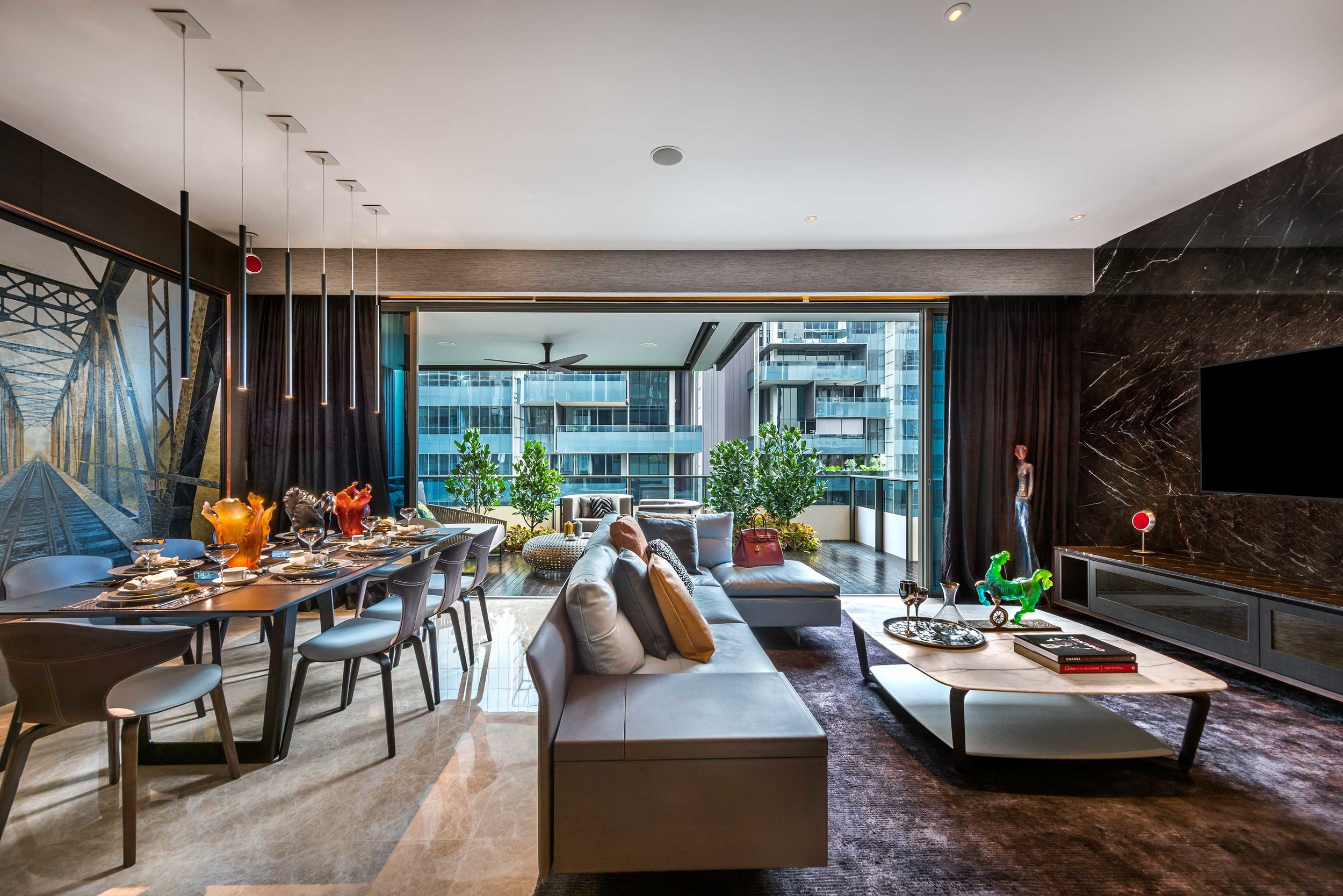
Here, comfort and luxury go hand in hand, setting up an environment that is, at once, cosy and statement-making. Throughout the interior spaces, fine-grained wood surfaces and rich earthy finishes envelop with their comfort, while stately, marble-cladded floors and walls educe opulence and luxury. Gold accents enliven the spaces with delicate glimmer. Soft cove lighting brings subtle highlights throughout, adding to the overall warmness and tranquillity.
Balance and meticulous attention to details are found everywhere, in the careful proportions of surface treatments, in the reciprocity between the grandeur of marble and wood finishes and the soothing lushness of textiles, drapery and bedspreads. Used throughout the residence, the presence of dark surface finishes is further balanced with the selection of light blue furniture from Poltrona Frau in the living and dining areas.
The master bedroom is a welcoming retreat and exudes calmness and luxury. The marble-cladded bedhead is a splendid centrepiece anchoring the space together with its prominent black and gold textural interlacements. Custom-made oval night stands bring in a reprieve from angular surfaces, while the handpicked Louis Poulsen pendant lamp enjoys its time in the spotlight against a dark wood panel backdrop.
In the daughter’s room, play and study areas coexist next to each other, with a generously sized bunk bed and study table inset into a raised platform that is spacious enough to be used for playtime activities. Storage and display cabinets accommodate plenty of toys and books, while maintaining a clean and uncluttered feel.
A Pavilion That Invites Pause for IndesignLive
http://www.indesignlive.sg/articles/projects/a-pavilion-that-invites-pause
Offering a welcoming breather in the heart of Singapore’s busy business district, DP Architects’ Archifest Pavilion invites the public to connect with each other and with the surrounding environment through design.
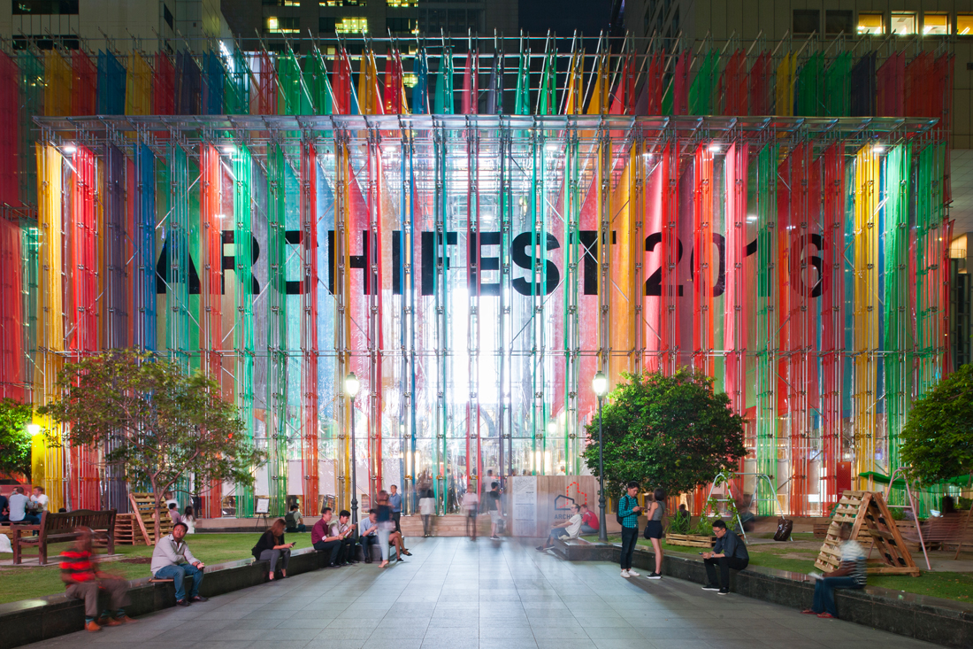
It has been a busy few weeks leading up to the highly anticipated opening of Singapore’s annual Archifest, organised by the Singapore Institute of Architects with the purpose to celebrating the architecture and the built environment of the city. With this year marking the event’s 10th anniversary, the festival saw the return of the Archifest Pavilion – a symbolic structure at the epicentre of Archifest’s activities – designed by DP Architects in the spirit of this year’s theme of Exhale that questions the rapid speed of life in dense cities.
“SIA’s theme challenged us to influence the city’s pace of life with architecture,” says Ang Guo Zi, Associate Director at DP Architects. “Can architecture alone really induce a city to ‘rediscover its own rhythm’? Located in the heart of the Central Business District, we found the context of that question excitingly provocative.”
For those working or living in the Central Business District, it has been impossible to miss the rising scaffolding and strips of colourful netting swiftly taking shape in the usually open green lawn space anchoring Raffles Place and its high-rise surroundings. Serving as a statement and as a functional space, the Pavilion answered to this year’s Exhale theme most profoundly, perhaps, by simply having been situated where it has been – a high-density, high-activity location filled with working professionals rushing to and from their daily meetings in a charged, hectic and, often, breathless environment.
The design team that included DP Architects, DP Engineers, DP Green, Illuminate lighting design consultancy, contractors and engineers Shanghai Chong Kee Construction Pte Ltd and Keon Consult Pte Ltd aimed to achieve a purposefully colourful and ephemeral look for the Pavilion’s structure. Seeking to make an immediate impact with energetic bands of colour, the Pavilion’s design sought to create an intimate and unique relationship with each of its incidental viewers, with hues of colours inviting visitors to pause, look up and appreciate their surroundings. Seeking to revitalise and enliven the busy urban landscape with its presence, the Pavilion aimed to elicit its viewers’ basic responses to vibrant colours and to influence the psychological and physiological responses to gradations of light for a positive reaction.
Apart from creating a colourful, albeit temporary, addition to the Raffles Place site, the DP Architects design team also approached the project with a sustainable point of view. The team developed the Pavilion’s skeletal scaffolding structure from the contractor’s existing stock with the goal to reuse the steel on future construction sites after the structure’s disassembly. Similarly, the team imagined the Pavilion’s polychromatic fins of colour to be reusable as well, with the multiple layers of colour to be composed of safety netting material to create density in colour and form and to be reused at upcoming construction sites after Archifest’s conclusion. Through the usage of the chosen materials, the design team also hoped to “invert the usual connotations of construction sites such as a sense of dislocation and loss” and to look at them instead as marks of progress and achievement.
“With the Archifest Pavilion, we wanted people to find a moment of wonder and respite in the heart of our bustling city,” says Ang. “There is no particular take-home message – each individual should frame his or her own story, own experience and memory of this transient place.”
Singapore's Playful New Bowling Center Integrates History and Vision for the Future for Interior Design
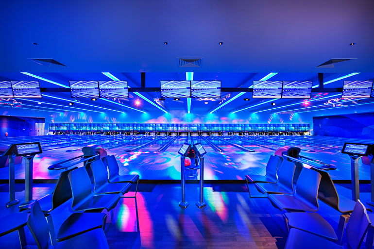
Mixing fun, history and functionality in an intriguing entertainment venue concept, interior design company Kyoob-id brings an unexpected level of profoundness and innovation to the new Orchid Bowl bowling center in Singapore. Located in Punggol, a transurban planning area and residential town, the bowling center is the latest addition to the waterfront area under the Punggol 21 initiative, launched to transform the northeastern coast area of Singapore into a self-sustaining waterfront enclave, representative of the 21st century living.
The design team at Kyoob-id approached the project with a unique perspective, integrating history and a new vision for Punggol, while maintaining a playful and fun atmosphere. Echoing back to Punggol’s legacy as an early fishing village,while emphasizing the town’s recent transformation into a forward-looking, sustainable waterfront development, Kyoob-id’s interior design team unveiled a modern interpretation of a waterfront city within the center’s interior in a light-hearted and non-obtrusive way through subtle references, colors and design features.
In a nod to Punggol’s history, Kyoob-id created an impactful entrance wall consisting of polygons in varying textures to represent abstracted leaves and vegetation while strategically placing two tree-like displays with clusters of polygonal acoustic panels adorning the abstracted tree canopies close to the entrance. “The fruit tree installation has successfully managed to bring the noise levels down significantly and created an aesthetic and meaningful design feature with a [compelling] story,” said Kyoob-id’s senior designer Nut Ruangsorn about the playful and functional design.
Throughout the bowling center’s spaces, the design team introduced curves created by vinyl anti-slip tiles and carpeting to subtly suggest the bends of a riverbed and features like textured panels, black galaxy solid surface counter tops and wall graphics to hint at both the past and the future of the bowling centre’s neighborhood. Along the bowling lanes, Kyoob-id used strategically placed LED lights to run parallel to the ball return and gutter tracks, giving the space a dynamic and futuristic look without distracting the bowlers. The design team deliberately placed the reception counter at the back of the bowling centre, so that the visitors could experience the space in its entirety.
With functionality and fun driving the bowling center's overall aesthetic, the legacy and future vision of the Punggol town come together in the final design in ways that do not seem forceful or contrived.
“We wanted to bring the external environment such as natural foliage that exists outside the center’s walls into the interior,” summarizes Ruangsorn. “Our plan was to retain a semblance of Punggol’s rich history and blend it with its dynamic vision of a new waterfront city as seamlessly as possible.”
