• About Me
  • Works
  • Publications
  • Updates/News
  • Contact
Menu

O-R Design

2 Sims Drive
Singapore , 387386
(+65) 9722-8724
design as meant to be

Your Custom Text Here

O-R Design

  • About Me
  • Works
  • Publications
  • Updates/News
  • Contact

A Cultural Revival: Four Seasons Hotel Jakarta

February 9, 2017 olha romaniuk

New York-based interior designer Alexandra Champalimaud brings her detail-oriented and culture-inspired design vision to the Four Seasons brand in Jakarta. Olha Romaniuk writes.

An expert in residential and hospitality interiors, Alexandra Champalimaud has a keen eye for design enriched by a deep understanding of local history and a sense of place. Having established her New York-based firm, Champalimaud, over 30 years ago, Alexandra has been tirelessly expanding her extensive design portfolio with a roster of renowned commissions such as the award-winning Algonquin Hotel in New York and the Waldorf Astoria. Despite and because of her international experiences, Champalimaud remains profoundly attune to the unique conditions of every project, executing designs that exhibit a keen understanding of their surroundings. With her latest hospitality project, the Four Seasons Jakarta, Champalimaud discusses her firm’s comprehensive design process for the hotel.

How do you approach each of your projects? Is there a systematic brainstorming process that you follow before you begin design or is the approach to every project different?

Every project requires a different thought process, depending on what the requests of the client are. There are numerous factors we take into account before starting each project, such as respect for local cultures and traditions. With the Jakarta project, we had the opportunity to tell the story of its past, present and future through our design and, therefore, naturally had to do our research. We take into account history, heritage and cultural context all while keeping longevity and timelessness in mind.

Four Seasons has been a staple on Jakarta’s hospitality scene for over 20 years. With the new building and new location, was there any intent to redefine or update the Four Seasons brand through interior design as well?

We were directed to create a magnificent space that could appeal to the guests and the locals on several levels. The hotel had to be designed to fit into its urban, sophisticated space, while remaining true to the Four Seasons brand, which is known for its absolutely world-class luxury hospitality experience.

Your studio is known for unique designs that tell a story and have their own character and personality. What message and personality do you hope the new Four Seasons Hotel Jakarta will convey to visitors?

We wanted to convey the local culture, history and traditions of both Asian and European cultures – Jakarta’s local traditions and its history with Western Europe, and the Dutch who traveled to the city as spice traders and left their mark on the region. The Dutch influences are conveyed, for example, in the design of Nautilus bar, which features a large mural of schooners en route to port with delicately swirling lines in the carpet to evoke the feel of the ocean.

For Four Seasons Jakarta, we wanted guests to be enveloped by the spirit of the space at the first moment of their arrival, which we did by creating an entrance of amazing scale, enormous height and elegance – [and a space that is also] contemporary, fresh and young.

Aside from being influenced by Indonesia’s Dutch Colonial period, what other cultural influences did you incorporate into the design?

We [made reference to] Indonesian design such as the gilded, hand-carved tiles affixed to the ceiling of The Library, which is a private space with handsome seating and jewel-toned walls. Meanwhile, Indonesians love their chocolate but adore jewellery even more, so we designed a patisserie to house an array of sweets in the fashion of a jewel box with gilded geometric trim. One of my favourite details are the his and hers custom-designed chairs found in the sitting area of the private suites.

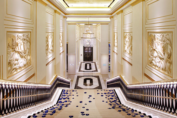
The lobby and the main staircase are particularly spectacular. What are some of the design details within these spaces that were designed to create a big impact as visitors entered the hotel?

There are many – the classical, gilded, 8.5-metre-high open space with ornamental metal work entry door and divider screens, the marble staircase with a custom vibrant rug, an almost 5-metre-high water feature carved in stone, the custom relief artwork from Hadiprana, the crystal chandelier from Lasvit…

In comparison with the hotel’s public spaces, the rooms appear more understated.

The guest rooms are a play on international culture coming to Jakarta, such as the Dutch in the 17th century, but also a reflection of the time when Jakarta was first founded. The rooms are classical in scale with a hint of modern details – a mix of late 18th, 19th and early 20th century furnishings. We chose a grey-blue colour scheme because it is one of the most sophisticated gentle colours, and is both uplifting and calming.

Were there any particular design challenges that you encountered during the design process?

One of the challenges we faced was how to convey this exciting city with its rich history and constant movement, where the women are fabulous and chic, and there is a delightful blend of different cultures. When I first visited Jakarta, I felt an undeniable pull towards the city and its people and when we were, then, approached with this project opportunity, we had the chance to tell the story of the city’s past, present and future through our design.

In interviews Tags interior design, alexandra champalumaud, jakarta design, four seasons, bespoke
Comment

The XTRA Christmas Gift Guide

December 24, 2016 olha romaniuk

From mid-century modern marvels to contemporary creations by renowned international designers, here are our picks for this holiday season’s must-have design staples.

http://www.xtra.com.sg/xtra-christmas-gift-guide/

It is no secret that design classics can make timeless gifts to suit even the pickiest gift recipients during the holidays. From mid-century modern marvels to contemporary creations by renowned international designers, here are our picks for this holiday season’s must-have design staples that are sure to endure the test of time and inject some panache into every household.

Herman Miller Maharam Placemat

A perfect way to add style to any dining table, Herman Miller’s Maharam placemats can set the tone for the holiday season with unmistakable quality that is signature to the textile company’s brand. Featuring iconic Eames and Alexander Girard designs, the placemats are sophisticated and playful at the same time, bringing colourful, abstract geometry into mealtime statement pieces.

Magis Ettore  

Konstantin Grcic’s cast-iron mule for Magis is a celebration of the brand’s resilient and whimsical personality in an ornamental piece that is, at once, a stylish doorstop, book stand, paper weight and a unique decoration for any home. For the holiday season, the limited edition Ettore, featuring the signature of the designer, is a fun and functional addition to any design enthusiast’s residence with its iconic shape and form, perfectly capturing the spirit of Magis.

Magis Happy Bird (Limited Edition)

Suitable for kids and kids-at-heart, the Magis Happy Bird is a perfect gift to add some stylish playfulness to a home. A part of the Me Too collection for Magis created by designer Eero Aarnio, the Happy Birdchair is a toy and an unconventional seat that encourages imaginative and creative play. Happy Bird is available in a special colour combination available exclusively at XTRA.

Tom Dixon’s Tank Series

Transcending the label of ordinary barware, Tom Dixon’s Tank Series brings the sophistication of simple geometric forms and exquisite materials to a collection of glassware designs fit for a refined drink ceremonial. Made from mouth-blown clear glass and finished with liquid gold and colourants, hand painted with copper detailing, the collection is intuitively functional, bearing the unmistakably Dixon-esque essence of style and simple geometry that make the bespoke barware stand in a league of its own.

Tom Dixon Scent Elements

The second scent collection by Tom Dixon is a celebration of the four classical elements found in nature – earth, fire, air and water. Each scent, designed to transform any space into a tantalising olfactory journey, is a unique composition made to reflect the individualistic character of each element and a true gift for the purists at heart who will enjoy the scents’ minimalist attitude.

Vitra Dolls by Alexander Girard

One of the most prominent figures in American design, Alexander Girard originally designed the colourful, decorative company of wooden dolls for his home in Santa Fe. Inspired by the works of popular art, the wooden dolls are half toys, half decorative elements that can serve as charming and quirky additions to any home interior.

Vitra Eames Elephant

A perfect accessory for a child’s room, the iconic Eames Elephant is an indoor-outdoor toy that is sure to awaken the creative instincts of a budding young designer-to-be. Originally developed by Charles and Ray Eames in plywood and now manufactured in plastic, the chair is an instant eye-catcher, appeasing to the kids as a fun-shaped and colourful toy and to adults as a well-recognised Eames classic, in and out of a child’s room.

Parachilna Aballs

Majestic in its blown opal matt glass and brass base, the irresistible Aballs lamp exudes allure with its sensuous shape that combines unparalleled craftsmanship and traditional art of hand blown glass. Designed by Jamie Hayon for Parachilna, the lamp stands out as a decorative lighting piece of a hard-to-match quality, enhancing any modern interior with its timeless shape and smooth glowing finish.

Tags xtra, xtra gazette, interior design, product design, furniture design, vitra, herman miller
Comment

Updating the Classics for Prestige Global

December 17, 2016 olha romaniuk

A well-executed contemporary classical design approach in residential applications goes beyond combining fine architectural details and sophisticated furnishings with clean-lined geometries and bold shapes and assesses how well these elements come together and how they can complement each other within a space. The result is elegant and enduring; a design that is neither trendy nor outdated in its approach.

With the notion that tradition and modernity can coexist, three homes’ interiors exemplify the refined appeal that a contemporary classical style can bring to a dwelling. Defined by a combination of distinctly classical interior proportions with timeless geometric shapes and warm brown and neutral colour palettes, one unit in a cluster house development and two condominium apartments offer inspired examples of spaces that transcend the typecasts of any specific time periods.

An impactful yet inviting living room delivers a balance in creating a striking first impression with its formal seating arrangement and distinctly classical proportions and in setting up a welcoming living space with the use of warm brown tones and accent lighting. Neutral lines and bold prints on the carpet and fixtures enliven the space, while the unique organic cluster of pendant lamps anchors the overall composition together.

In the dining room of this unit, the colour palette is deliberately muted, immediately enhancing the presence of the stately, classical proportions of the wall panelling that, in turn, frame the display of photographic works on each wall. The classical dining table and chairs are the central masterpieces of the room, setting up a reciprocal dialog with the decisively contemporary lamp that hangs in place of a typical chandelier.

Beadings and treatment of the walls in the bedroom continue the classical language introduced in the dining room. Strong linear geometry asserts itself in the bedhead behind the plush bed cushions but is softened by the unobtrusive brown and neutral colours used throughout the room. A statement piece – a leather wingback chair in deep blue – draws the gaze to itself and neutralises the earthy shades that dominate the rest of the bedroom.

A corridor at this condominium unit proves that it, too, can be more than a simple transitional space. As with the rest of the spaces within the unit, where the design capitalises on simple, clean lines to create some pleasing spatial arrangements, the corridor takes on a captivating identity of its own, where strong geometry and symmetry govern and guide through the space. Contemporary artworks and picture lamps, along with the directional cove lighting above, remind of a formal art gallery display, while the brown and beige tones remain pleasant to the eye in their contrasting colour pairings.

Tags prestige global, bespoke, interior design, singapore design
Comment

December 15, 2016 olha romaniuk

Pivotal in the 20th century design history, the definitive Bubble Lamp by industrial designer George Nelson continues to remain a tour-de-force of aesthetics and functionality decades after its making.

http://www.xtra.com.sg/a-modern-icon/

It has been almost seventy years ago since one of the most familiar iconic objects of Modernism – the Bubble Lamp – was created by one of the founders of American Modernism and a long time design director of Herman Miller, George Nelson. Since then, the lamp, with its simultaneously organic and highly structured form, has become an undeniable staple of just about every designer and designer-at-heart’s home.

Like many brilliant inventions before it, the Bubble Lamp’s creation happened as a stroke of unexpected inspiration, when George Nelson, who terribly wanted to acquire a silk-covered, spherical Swedish lamp for his modest office but found the steep price of $125 to be prohibitive in the late 1940’s, decided to create an affordable solution of his own, using a material developed for military use in the postwar era.

…THE BUBBLE LAMP SILENTLY BEACONS ONE TO KEEP THE EYES AND THE MIND OPEN TO THE WORLD.

Using lightweight steel to fashion a spherical frame, Nelson chose to experiment with a self-webbing plastic spray used to “mothball” military airplanes and ships at the time to create a fibrous shell of the lamp and applied a coat of plastic to give the lamp’s skin a smooth and translucent finish. As Nelson recalled, “By the next night we had a plastic-covered lamp, and when you put a light in it, it glowed, and it did not cost $125.”

Exploring the fabrication method to create a variety of bulbous shapes, Nelson designed the entire Bubble series, comprising pendants, sconces, tripods, table and floor lamps, in 1952 for Howard Miller.

While out of production for many years until the 1990’s, today the Bubble Lamp’s clean lines and distinctive shape continue to find their way into residences all over the world. At once opaque and transparent, the lamp emits a soft and even glow that eliminates glare and is pleasant to the eye, making it a highly functional art piece in any home. The timeless nature and form that is both retro-futuristic and modern is easily incorporable with any style, emanating broad appeal to different audiences.

But more than a statement piece or a talking point of a dinner party, the Bubble Lamp is a testament to creativity, integrating technological advances from industries outside of design and architecture to enhance the functionality of an aesthetically driven object. A practical work of art exemplifying the possibilities of new material exploration and production, the Bubble Lamp, much like its designer during his lifetime, continues to epitomise the value in design innovation and creative design thinking. With countless possibilities of what can happen when one goes beyond the expected standards and learns from other industries, the Bubble Lamp silently beacons one to keep the eyes and the mind open to the world.

Tags george nelson, lamp, bubble lamp, interior design, industrial design
Comment

In Pursuit of Happiness (Bhutan Happiness Centre) for XTRA Gazette

November 18, 2016 olha romaniuk

A dedicated happiness centre in Bhutan teaches valuable lessons in achieving contentment within facilities that inspire with their ecologically and culturally sensitive design approach.

http://www.xtra.com.sg/in-pursuit-of-happiness/

Happiness comes in many different forms and variations. The pursuit of it is as old as time, driving individual motivations, aspirations, hopes and dreams. At national and international levels, the notion of happiness can be as abstract as it can be elusive – a philosophy of a sort that can, nevertheless, unify and connect individual ideas in a larger whole, becoming an integral part of a national ethos.

A lofty concept as such, the idea of pursuing happiness at a national level has been put into practice in the recent years in Bhutan, the first country in the world to apply the Gross National Happiness (GNH) rate instead of the GDP to measure the wellbeing of the country. With the GNH rate first implemented in 2008, Bhutan’s government executed measures to promote an alternate way of evaluating happiness rooted in non-economic aspects of wellbeing.

It is with this notion in mind that the Bhutan Happiness Centre came about as a learning and sharing platform to encapsulate the ideas and experiences of happiness through meditation and freedom. Set against a peaceful backdrop of a barely disturbed pine forest, the centre beacons with a promise of a noble vision that happy, balanced life should achievable for everyone.

With a specific aim to tackle two out of four pillars that comprise the GNH – the preservation of culture and identity and environmental conservation – the Bhutan Happiness Centre is a balance of natural and human-made elements that come together as a cohesive whole. Straight lines and curves of buildings that merge as part of the overall architectural language evoke equilibrium and peace within a setting of a sustainable universe.

Spaciously spread out on a sloping terrain next to the Bumthang river, the Centre’s architecture conveys a sense of belonging in its unpretentious language of vernacularism, deliberately devoid of sweeping architectural gestures or iconic monumentality. Designed by 1+1>2 Architects, the centre’s cluster of buildings that include a meditation hall for 250 people and a 100-seat convention house is driven by the ideas of harmonious coexistence of people and nature.

The two-storey meditation hall embodies the idea of the earth and heaven coming together with the first storey’s round shape fitting neatly under the second storey’s rectangular parameters. Similarly, the elliptical form of the convention house takes inspiration from the Buddha tree, incorporating vernacular decoration details within a contemporary context.

Traditional, locally available materials like wood, stone and soil compose structural elements that are, at once, humble and purposeful. Coming together as parts of a natural system, the harmonies between the materials connect humans with the nature around them and expose the Centre as a part of, rather than an intrusion of, a delicate eco-system.

Establishing a virtuous vision of attainable happiness for all, the Bhutan Happiness Centre sets precedents of achieving gross national happiness in action. With visitors from all over the world coming to the Centre with a purpose of exploring the fairly abstract concept of happiness on their own terms, Bhutan’s vision for societal wellbeing remains alive and well, inspiring a much-needed global outlook that happiness and economic success do not need to be mutually exclusive.


Tags architecture, bhutan architecture, bhutan happiness centre, 1+1 2 architects
Comment

A House of Wellness

October 11, 2016 olha romaniuk

ONG&ONG’s winning competition entry for the Singapore Red Cross House celebrates the organisation’s rich history and lifelong legacy of altruism and philanthropy. Olha Romaniuk writes.

http://www.indesignlive.sg/articles/projects/a-house-of-wellness

Attempting to reinterpret history from a contemporary perspective is never an easy feat. However, for the design competition that sought to redevelop the Singapore Red Cross House earlier this year, the design team at ONG&ONGdid just that with a winning design proposal that addressed the main historical and programmatic considerations of the brief, updating the Red Cross House with a fresh, new look and addressing its historical legacy along the way.

For the SRC – an organisation with a seventy-year heritage and history rooted in local and international humanitarian efforts – the design team at ONG&ONG faced a twofold requirement that demanded a preservation of the original Red Cross House structure and an introduction of a new building within the existing site. The final design, more than just blending the old and the new, had to reflect the spirit of the organisation and meet and anticipate the current and future needs of the Singapore Red Cross.

According to the ONG&ONG SRC redevelopment design team, “The original SRC House, together with its classically iconic façade, needed to be maintained and incorporated into the new grounds. SRC also required a new building in order to expand its repertoire of services and capabilities, where a revamped site would provide state-of-the-art facilities in a modernised setting, catering for the present needs and requirements of the SRC, while keeping an eye on possible future expansion.”

As part of the design proposal, ONG&ONG’s design team introduced a new building that took full advantage of its site, while referencing SRC’s nostalgic and rich past, and its existing building’s surrounding context. Thus, the team proposed to restore the original Red Cross House building to its initial 2-storey form and convert it into a space for the Red Cross Academy and a thrift store, adding a new 10-storey office tower and connecting the existing and new structures via a landscaped plaza and a detached office lift core.

The new and the old buildings convey the history and legacy of the Singapore Red Cross in a variety of ways. The tower is unmistakably indicative of its organisation from the very first glance – the north and south façades feature the Red Cross’s colour scheme in a composition of concrete geometric fins, folded like paper planes and forming the organisation’s distinctive logo. Meanwhile, the original structure reminds of its days of glory, with a restored shape and proportion that recalls the building as it used to be decades ago.

The ONG&ONG team bridges the original building and the new tower with an elevated event plaza, creating a physical transition via a detached office lift core that connects with the event space. “Beyond bridging the internal spaces of both the original and new SRC structures, the plaza not only provides the means and space for any number of SRC initiatives and engagements, but also allows the institute to easily and efficiently accommodate an increased number of people and volunteers,” says the design team.

In fact, it is the consideration for the volunteers and the people behind the Singapore Red Cross’ mission of selflessness and altruism that drives much of the design of the SRC House project. ONG&ONG’s overall design strategy emphasises its WELL Building Standard and systems, reaching for an optimisation of a built environment that would sustain the health and livelihood of the buildings’ users through well-ventilated, well-lit spaces that promote overall wellbeing.

“Taking into account that many of the new SRC House’s inhabitants and end-users would be there in the spirit of volunteerism, health and wellbeing were definite points of emphasis for us when approaching the SRC redevelopment project,” concludes the design team. “These design standards represent a holistically modern approach to health – with all amenities and facilities, even lighting and air quality, all geared towards nurturing and sustaining the buildings’ end-users.”

Tags ong&ong, architecture, singapore architecture, red cross house
Comment

Bringing Comfort to Luxury for Prestige Global Designs Blog

October 9, 2016 olha romaniuk

Here, comfort and luxury go hand in hand, setting up an environment that is, at once, cosy and statement-making. Throughout the interior spaces, fine-grained wood surfaces and rich earthy finishes envelop with their comfort, while stately, marble-cladded floors and walls educe opulence and luxury. Gold accents enliven the spaces with delicate glimmer. Soft cove lighting brings subtle highlights throughout, adding to the overall warmness and tranquillity.

Balance and meticulous attention to details are found everywhere, in the careful proportions of surface treatments, in the reciprocity between the grandeur of marble and wood finishes and the soothing lushness of textiles, drapery and bedspreads. Used throughout the residence, the presence of dark surface finishes is further balanced with the selection of light blue furniture from Poltrona Frau in the living and dining areas.

The master bedroom is a welcoming retreat and exudes calmness and luxury. The marble-cladded bedhead is a splendid centrepiece anchoring the space together with its prominent black and gold textural interlacements. Custom-made oval night stands bring in a reprieve from angular surfaces, while the handpicked Louis Poulsen pendant lamp enjoys its time in the spotlight against a dark wood panel backdrop.

In the daughter’s room, play and study areas coexist next to each other, with a generously sized bunk bed and study table inset into a raised platform that is spacious enough to be used for playtime activities. Storage and display cabinets accommodate plenty of toys and books, while maintaining a clean and uncluttered feel.

Tags prestige global, interior design, interior design blog, singapore design
Comment

A Pavilion That Invites Pause for IndesignLive

October 5, 2016 olha romaniuk

http://www.indesignlive.sg/articles/projects/a-pavilion-that-invites-pause

Offering a welcoming breather in the heart of Singapore’s busy business district, DP Architects’ Archifest Pavilion invites the public to connect with each other and with the surrounding environment through design.

It has been a busy few weeks leading up to the highly anticipated opening of Singapore’s annual Archifest, organised by the Singapore Institute of Architects with the purpose to celebrating the architecture and the built environment of the city. With this year marking the event’s 10th anniversary, the festival saw the return of the Archifest Pavilion – a symbolic structure at the epicentre of Archifest’s activities – designed by DP Architects in the spirit of this year’s theme of Exhale that questions the rapid speed of life in dense cities.

“SIA’s theme challenged us to influence the city’s pace of life with architecture,” says Ang Guo Zi, Associate Director at DP Architects. “Can architecture alone really induce a city to ‘rediscover its own rhythm’? Located in the heart of the Central Business District, we found the context of that question excitingly provocative.”

For those working or living in the Central Business District, it has been impossible to miss the rising scaffolding and strips of colourful netting swiftly taking shape in the usually open green lawn space anchoring Raffles Place and its high-rise surroundings. Serving as a statement and as a functional space, the Pavilion answered to this year’s Exhale theme most profoundly, perhaps, by simply having been situated where it has been – a high-density, high-activity location filled with working professionals rushing to and from their daily meetings in a charged, hectic and, often, breathless environment.

The design team that included DP Architects, DP Engineers, DP Green, Illuminate lighting design consultancy, contractors and engineers Shanghai Chong Kee Construction Pte Ltd and Keon Consult Pte Ltd aimed to achieve a purposefully colourful and ephemeral look for the Pavilion’s structure. Seeking to make an immediate impact with energetic bands of colour, the Pavilion’s design sought to create an intimate and unique relationship with each of its incidental viewers, with hues of colours inviting visitors to pause, look up and appreciate their surroundings. Seeking to revitalise and enliven the busy urban landscape with its presence, the Pavilion aimed to elicit its viewers’ basic responses to vibrant colours and to influence the psychological and physiological responses to gradations of light for a positive reaction.

Apart from creating a colourful, albeit temporary, addition to the Raffles Place site, the DP Architects design team also approached the project with a sustainable point of view. The team developed the Pavilion’s skeletal scaffolding structure from the contractor’s existing stock with the goal to reuse the steel on future construction sites after the structure’s disassembly. Similarly, the team imagined the Pavilion’s polychromatic fins of colour to be reusable as well, with the multiple layers of colour to be composed of safety netting material to create density in colour and form and to be reused at upcoming construction sites after Archifest’s conclusion. Through the usage of the chosen materials, the design team also hoped to “invert the usual connotations of construction sites such as a sense of dislocation and loss” and to look at them instead as marks of progress and achievement.

“With the Archifest Pavilion, we wanted people to find a moment of wonder and respite in the heart of our bustling city,” says Ang. “There is no particular take-home message – each individual should frame his or her own story, own experience and memory of this transient place.”

Tags dp architects, architecture, singapore architecture, singapore design, archifest
Comment

Bringing Comfort to Luxury

October 2, 2016 olha romaniuk

http://prestige-global.com/bringing-comfort-to-luxury/

Here, comfort and luxury go hand in hand, setting up an environment that is, at once, cosy and statement-making. Throughout the interior spaces, fine-grained wood surfaces and rich earthy finishes envelop with their comfort, while stately, marble-cladded floors and walls educe opulence and luxury. Gold accents enliven the spaces with delicate glimmer. Soft cove lighting brings subtle highlights throughout, adding to the overall warmness and tranquillity.

Balance and meticulous attention to details are found everywhere, in the careful proportions of surface treatments, in the reciprocity between the grandeur of marble and wood finishes and the soothing lushness of textiles, drapery and bedspreads. Used throughout the residence, the presence of dark surface finishes is further balanced with the selection of light blue furniture from Poltrona Frau in the living and dining areas.

The master bedroom is a welcoming retreat and exudes calmness and luxury. The marble-cladded bedhead is a splendid centrepiece anchoring the space together with its prominent black and gold textural interlacements. Custom-made oval night stands bring in a reprieve from angular surfaces, while the handpicked Louis Poulsen pendant lamp enjoys its time in the spotlight against a dark wood panel backdrop.

In the daughter’s room, play and study areas coexist next to each other, with a generously sized bunk bed and study table inset into a raised platform that is spacious enough to be used for playtime activities. Storage and display cabinets accommodate plenty of toys and books, while maintaining a clean and uncluttered feel.

Tags prestige global, interior design, leedon, poltrona frau
Comment

Dubai’s Latest Icon Soars to New Heights

October 1, 2016 olha romaniuk

Poised to become the focal point of a new development, the latest iconic structure on Dubai’s skyline is set to convert the Dubai Creek Harbour area into one of the newest premiere residential and leisure destinations. Dubbed ‘The Tower’, the super tall megastructure is a collaboration between Santiago Calatrava and engineer/architect-of-record Aurecon, combining a unique soaring form with innovative technical and structural features that aim to create a landmark indicative of Dubai’s futuristic vision.

To those who are familiar with Calatrava’s previous iconic structures, the striking proposal for The Tower, which was selected from a total of six schemes by global architecture firms, immediately brings to mind the signature ribbed character of the star architect’s earlier projects. Nevertheless, The Tower’s form, with its network of steel cable stays radiating from the structure’s central reinforced concrete core, promises to become more than just a single-stroke statement, taking inspiration from the local context and mixing traditional and contemporary references for a context-appropriate response.

Beyond the aesthetics of The Tower, the megastructure promises to attest to the combined structural, technical and environmental prowess of Calatrava and Aurecon. The two teams will collaborate with each other on a number of design and technical features, working closely during the design process to arrive at optimal solutions for the structure. With a strong focus on sustainability and energy efficiency, The Tower will boast an advanced cooling system to respond to and mitigate Dubai’s hot weather, with integrated vegetation, shading system and wing doors that also contribute to the building’s energy efficiency. Additionally, the water collected from the cooling system will be utilised to clean The Tower’s façade.

As an upcoming iconic destination rooted in and inspired by its context, The Tower aims to hit all the right notes, combining a striking form with ambitious structural and environmental considerations. When completed in four years, the megastructure, with its sheer height, will transform Dubai Creek Harbour and Dubai at large. The architects and engineers involved in the project have expressed hope that The Tower will also set precedents for its design merit.

In the words of Mohamed Alabbar, Chairman of Emaar Properties that commissioned the project, “The design is a perfect fit for our requirements and integrates not just design excellence, but also strong environmental and smart-tech considerations. With The Tower, we are delivering a compelling destination that will add long-term economic value to Dubai and the United Arab Emirates.”

Tags dubai, calatrava, aurecon, architecture, dubai architecture
Comment
← Newer Posts Older Posts →

© olharomaniuk.com, 2014-2018
All Rights Reserved