• About Me
  • Works
  • Publications
  • Updates/News
  • Contact
Menu

O-R Design

2 Sims Drive
Singapore , 387386
(+65) 9722-8724
design as meant to be

Your Custom Text Here

O-R Design

  • About Me
  • Works
  • Publications
  • Updates/News
  • Contact

Linehouse Uncovers the Past for a Shanghai Office

July 27, 2017 olha romaniuk

 first China office for backpack manufacturer Herschel Supply, designed by Linehouse, echoes the rapidly transforming urban fabric of its neighbourhood.

Enigmatic and eye-catching, the laneway entrance to the Herschel Supply office in the Jing’An District of Shanghai is a beguiling, asymmetrical feature. It suitably encapsulates the design philosophy of architecture and interior design practice Linehouse, and also serves as a hint to the interior framework that organises the Canadian lifestyle brand’s first China office.

The entrance, like its surrounding site, is as much a revelatory glimpse into the building’s internal activities as an indication of the surrounding urban flux. In this part of the city, many of the old residential structures are being demolished or stripped back, revealing the architectural details of Shanghai’s past.

“We wanted the design to lend itself to the streetscape, to capture this urban quality,” says Briar Hickling, co-founder of Linehouse, about the project’s relationship to its site. “Herschel is a design-driven brand and we aimed to capture both the urban/nature and utilitarian qualities in the spatial design of the office.”

As with many of the firm’s projects, the design process for the Herschel Supply office began with a desire to create a unique spatial experience that, at once, formed a dialogue between the shared and the private zones in the 134-square-metre unit and revealed the process of deconstruction relevant to the neighbourhood context. The design team deliberately used materials such as corrugated metal, concrete, raw steel and black cork to reflect the urban and utilitarian nature of the brand. A pitched metal framework was inserted into the office space as a strong gesture that extends the streetscape into the interior.

Lined with perforated and solid corrugated stainless steel, the framework dictates the different programmes. Glass partitions divide the structure and operable sliding doors unveil or conceal the meeting room and pantry areas to the open workspaces beyond. In some zones, ceiling panels were omitted to open up views to the surrounding structure, further blurring the boundaries between the ‘public’ or shared and the private, and between the new and the previously constructed.

An extension of its neighbourhood, the Hershel Supply Shanghai office is, at once, a part of its urban fabric and an exemplification of change in an evolving urban residential area. Hickling affirms, “Our approach for this project was to create something unique and unexpected, which challenges the traditional notion of what an office or workspace should be.”

In projects Tags interior design, hershel supply, linehouse, shanghai, shanghai design
Comment

Space Matrix Brings Context and Experience to Microsoft Taipei

July 20, 2017 olha romaniuk

Microsoft’s Taipei office by Space Matrix Singapore anchors the global brand in the local culture through spaces that enhance the employee experience and showcase the brand’s products.

For the team at Space Matrix, designing the 75,000-square-foot Microsoft Taipei office was as much of an exercise in understanding the values of the brand as it was a cultural study. In line with the client’s goals for the space, the new office design provides a departure from the previous traditional office environment, unveiling dynamic spaces to cater to the local teams’ needs, while promoting future growth.

Aligning the brand and the local culture was identified as one of the key requirements for the new office. The people-centric aspect became paramount in establishing the overall direction for the design across five floors.

“We believe that spaces are for people,” says Archie Cruda, Associate Director, Design Excellence Centre at the Singapore studio of Space Matrix. “Given that Taipei’s culture is people-centric, there was a seamless alignment in integrating the brand into the local culture and context.”

Across all levels, Space Matrix followed Microsoft’s new global design guidelines for space distribution, devised to cater to various types of human interaction: collaborative, shared and individual work spaces. The client’s main concern was that the teams might resist the changes that would come with the new office, so the design team also gave priority to creating destinations on each floor that would bring people together, building a sense of community in the process.

By bringing contextual considerations into the development of Microsoft Taipei’s office spaces, the design team enabled an easier transition from the old to the new office setting, developing work and social areas rooted in Taipei’s culture.

Thus, level 15 evokes the old heritage Mountain Line Train, level 16 transports its visitors to a lush balcony in a Taipei apartment, level 17 to a Taipei night market, and 18 to a vibrant river front. Level 19 features a customer platform. The team also developed creative graphics to bring elements of the themes to life (for example, the creative use of ceiling lights and graphics represent Taiwan’s night markets).

The integration of Microsoft products in subtle and seamless ways was another key component of the design. In Cruda’s words, “The client wanted to showcase the Microsoft product but in a very subtle, non-confrontational way, believing that technology should not overpower the space but be intuitive and enhance the human experience.” Provisions were implemented to allow visitors to interact with Microsoft’s latest developments within the new office. It shows how technology, when integrated smartly and unobtrusively, can enhance the human experience.

In projects Tags interior design, taipei design, space matrix, office design, microsoft
1 Comment

A Global Discussion About the Future of Our Cities

June 21, 2017 olha romaniuk

RIBA’s first-ever International Week brings together leading names in architecture to open a global discourse on the roles architects can play in shaping future cities.

With an aim to bring together some of the most renowned architects representing continents around the globe, the Royal British Institute of Architect’s (RIBA’s) inaugural International Week is a high-profile event set to promote constructive discourse and debate on the future of cities.

Tackling the issues of design in an age when more and more people are living in cities than beyond them, leading professionals including Ma Yansong, Sir David Chipperfield, Odile Decq and Amanda Levete, among others, are scheduled to speak at a keystone conference. Titled ‘Change in the City: Opportunities for Architects in the New Agenda’, the conference will comprise a part of the International Week events.

It will address urban design challenges and opportunities as laid out in the ‘New Urban Agenda’ – a framework adopted at the United Nations Conference on Housing and Sustainable Urban Development that tackles how cities should be planned. The conference’s roster of international speakers will seek experts’ perspectives and examine key opportunities for architects highlighted in the New Urban Agenda.

Anchoring on three main themes – housing, cohesive society and cultural heritage – the panel of experts will seek to interpret what the New Urban Agenda defined by the UN summit (and attended by very few architects) means for architecture, including how it can be adapted by architects to stay relevant in the rapidly changing times.

RIBA President Jane Duncan has commented: “Architects need to play a vital role in shaping our urban future. RIBA’s International Week will connect with architects, no matter where or what size their practice is, to help them understand the potential impact and opportunities of global urbanisation. Under the umbrella of the New Urban Agenda, the week will provide explanation and inspiration, showing how the architecture profession can use its skills over the next two decades to make a valuable and long-lasting contribution to our future cities and society.”

The ‘Change in the City’ conference will form an integral part of a week of activities from 3 to 7 July at the RIBA and serve as a vehicle for discussion of current issues such as rapid urbanisation and migration, from architectural and sociological perspectives. The conference will be accompanied by a free exhibition, showcasing the participating architects’ work in relation to contemporary urban challenges.

In events, news Tags ma yansong, david chipperfield, elizabeth diller, odile decq, architecture, RIBA, international week
Comment

House with an Atrium for IndesignLive

June 7, 2017 olha romaniuk

In a quiet Queenstown neighbourhood, a family house by RT+Q Architects defies the disadvantages of its site and poses creative solutions to bring light and air into its interior spaces.

It is not an easy accomplishment to design a house that retains a façade of privacy on its public-facing exterior, yet feels bright, inviting and filled with natural light behind its public face. Yet, it is a spatial juxtaposition that appears as a natural solution within the aptly named House with an Atrium by RT+Q Architects, which has designed the residence to make the maximum use of its site and to respond to the owners’ programmatic requirements.

From the very beginning, the clients – a couple with three children – expressed their desire for a design that would allow plenty of daylight into the interiors of their house. A challenging task for a site situated on a North-South facing plot of land and sandwiched between two other residential properties. The configuration of the rectangular plot also hindered the design team at RT+Q from designing big openings at the East- and West-facing façades. As a solution, the team chose to design a house with a large, double-volume atrium that pierced the first and second levels of the residence, bringing in light and air without attracting too much heat from the afternoon sun.

“One feature of a lot of our buildings is that their front façades do not give too much away but, internally, the houses still feel very open,” says Rene Tan, Director of RT+Q Architects, highlighting the recurring theme within a lot of firm’s projects. Within the House with an Atrium, too, the titular central void is instrumental in creating a sense of openness and space from the inside.

With the courtyard and its two-storey high green wall, the configuration of the communal spaces around the inviting atrium became a logical choice. On the first floor, the design team positioned the gallery and the dining area directly across from each other, providing expansive, unobstructed views of activities taking place at the opposite, East and West ends of the house, while placing a spacious living room at the front of the house facing out to the vibrant green wall. On the second floor, the team designed a master suite overlooking the atrium’s courtyard and the spaces below, giving the clients a broad overview of the entire house from the comfort of their room. Other bedrooms were given more privacy by being set back from the atrium via elongated circulation spaces around the internal courtyard.

In a similar, strategic move, the RT+Q team incorporated open light courts and glass floors above selected areas of the basement to bring natural light below ground and make the lobby, tuition and entertainment areas, as well as various service spaces, a welcoming, well-lit continuation of the family spaces above. The choice of materials, like light grey concrete and marble throughout the basement and upper floors, further enabled the team to create a sense of space and openness within the 7,700 square foot home.

The team took special delight in designing the first-storey staircase, which was crafted in the same spirit of bringing lightness and various transparencies into the dwelling. “The owners were adventurous enough to go with a different kind of staircase,” says project lead Allan Tongol. “As a result, we went with perforated steel as a chosen material for the treads and the rises, making the whole structure, just like the house itself, look transparent and light.”

In projects Tags architecture, singapore architecture, residential, singapore design, rt+q
Comment

Tradition and Inclusivity in Balance for IndesignLive

June 3, 2017 olha romaniuk

For the Singapore Chinese Cultural Centre, DP Architects merge traditional Chinese influences with a forward-thinking design vision to create a venue that fosters socio-cultural interactions.

As a new cultural landmark complementing the neighbouring Singapore Conference Hall in the central business district, the Singapore Chinese Cultural Centre (SCCC) is a thoughtful amalgamation of functional and educational spaces with an expansive programme driven by innovation and anchored in culture and arts.

Designed by DP Architects with landscape consultant DP Green, the new building is the answer to a design brief that called for a forward-looking, and spatially and socially inclusive building that would create a welcoming destination for diverse groups of visitors.

The new venue walks a fine line between fitting in with its surrounding context and standing out. The SCCC is a one-stop destination for performances, exhibitions and cultural activities. To bring coherence to the composition of programmes held within, DP Architects gave the building a clean and contemporary look that also connects to the neighbourhood around it.

DP took inspiration from traditional Chinese three-tiered architectural compositions, and organised the SCCC in a functional stack for clarity of programmes, circulation and planning. Articulation of the architectural language reveals itself in three distinctly defined tiers: an elevated base that offers public spaces below, a solid body that contains all the main functions, and a glass crown for performances and cultural activities.

The DP team also drew inspiration from traditional Chinese landscape art to conceptualise the SCCC building and connect it to the setting around it. “The landscape is usually expressed with rough strokes (皴 in Chinese) to outline the coarse nature, while the building is depicted with more refined representations,” recalls Wang Ying, Associate Director, DP Architects. Likewise, in the SCCC, the juxtapositions exist between the box form and the multi-faceted podium, between the transparent top and the opaque bottom, and between the smooth crown and textured base. The juxtapositions create a balanced dialogue, echoing the artistic sensibilities found in Chinese landscape paintings.

As a result, the subtle implementation of Chinese architectural and artistic influences and the clean, contemporary expression of these ideas in the final design allows the SCCC to serve as a beacon of cultural identity and heritage, while remaining harmonious and inclusive of broader communities. According to Ying, “The mix of contemporary ideas in the facade treatment and traditional architectural convention in the planning embodies the spirit of respect. The architecture remains true to Chinese culture and heritage while becoming a conduit for interactions from various socio-cultural elements.”

In projects Tags dp architects, dpa, architecture, singapore architecture, singapore design, singapore, culture
Comment

Contextual Revival, Resort-Style for IndesignLive

May 18, 2017 olha romaniuk

The new Movenpick Resort & Spa in Bali merges aspects of traditional Balinese culture, local history and contemporary Indonesian craftsmanship in a unique array of spaces and installations.

The recent opening of Bali’s new lifestyle destination, the Samasta Village shopping and cultural complex – with Movenpick Resort and Spa at the centre of the development – has brought a new wave of tourist activity to laid-back Jimbaran. The location has a long history as a fishing village and the resort, while expansive, exhibits a sensitive response to its local history and surrounding context. Indonesian firm Hadiprana have celebrated the humble beginnings of the village within the resort’s spaces and through specially commissioned artworks.

Open, airy and distinctly contemporary in its overall aesthetic, Movenpick acknowledges its Jimbaran location in subtle but striking ways. Inspired by the lifestyle of the local fisherfolk, from the equipment used on a daily basis within the trade to the crafts that are a part of their daily lives, Hadiprana’s design takes cues from the vernacular. And in so doing, it unveils an updated reinterpretation of local references.

Allowing for a certain playfulness in scale and application, these design elements – such as the form of a wave in the carvings on lobby partitions and wall panels – appear through the public and private areas of the resort. These details tie the spaces together.

The subtle and overt references to nature weave a consistent design thread. Carefully curated materials and visual porosities create continuous connections with the landscape beyond the walls. The resort fully embraces the setting around it – from the dramatic promenade piercing through the lobby and framing the view out to the landscape and trellised structure beyond, to the ground-level restaurant Anarasa with floor-to-ceiling windows and a sheltered outdoor dining area, to slivers of greenery that make their way into the openings and voids that puncture the building’s mass at strategic locations.

Artworks and installations were commissioned out and produced in-house, and are positioned throughout the resort to reinforce the connection to nature and the local context of Jimbaran. A mix of custom installations from Hadiprana Artwork, furniture from product designer Alvin Tjitrowirjo, and handpicked paintings and statues by local painters and sculptors form an impressive collection that honours Balinese culture and celebrates contemporary Indonesian art as a whole.

According to the team at Hadiprana, “The selection and production of art installations was a well-thought process considering the theme, colours and the whole interior concept. Therefore, the artworks were selected not just for decoration but to give ‘soul’ to the whole resort area.”

In projects Tags architecture, interior design, bali design, bali, hadiprana, movenpick
Comment

A Hub for Creative Collisions for IndesignLive

May 4, 2017 olha romaniuk

Asylum designs a co-working environment suited for innovators from all industries.

Co-working has become a preferred way of working for many companies and start-ups, thanks to its offering of workplace flexibility and networking opportunities. With the recent spurt of co-working hubs all around Singapore, businesses looking for a workspace to suit their needs are in no shortage of options.

Collision 8 is one of the latest co-working spaces to open here, and is the brainchild of Michelle Yong, head of Aurum Land, the property development arm of construction conglomerate Woh Hup, and John Tan, serial entrepreneur and partner at two micro venture capital funds. With this project, Yong and Tan have envisioned a cross-industry collaborative environment supported by a community building programme to facilitate collisions fundamental to the growth of innovative businesses.

For Yong and Tan, the biggest distinction between Collision 8 and other co-working spaces is the focus on the community and the notion of ‘collisions’, beyond just the space. Says Yong, “By engineering serendipity through member curation and monthly personalised introductions by our dedicated community manager, we are uniquely placed to foster high value connections between our members, something that typical co-working spaces do not offer.”

With a determination to cultivate a communal spirit within Collision 8, Yong and Tan enlisted creative design agency Asylum to materialise the main objective of creating an aspirational and sophisticated, yet playful and energetic workspace, through spatial planning and interior design. As the co-founders’ design brief called for a series of spaces that exuded exclusivity, yet allowed for opportunities for members to mingle, gather and exchange ideas, Asylum aimed to provide a range of public and private areas that invited different modes of interaction.

The Asylum team paid particular attention to the public spaces, from the warmly lit library lined with glass cabinets displaying a personal collection of spirits, to the adjacent bar and lounge area, all set against a panoramic backdrop of the Marina Bay Sands, Boat Quay and Fort Canning Park. “We wanted the ‘heart’ of the space to be highly energetic, a space where members could mingle, gather and exchange ideas,” says Cara Ang, design director of Asylum. “What better way to have a nice conversation than over a cup of coffee or a good whisky? Elements such as a library lounge, a bar and a reception area, designed with the intention to heighten the exclusive atmosphere of Collision 8, fell into place, setting the ideal backdrop for social interaction.”

To accommodate a variety of working styles for the tenants, the Asylum team planned for an assortment of work settings, ranging from private offices to hot desks, breakout spaces and meeting rooms. Depending on the nature of the working environment (private, semi-private, highly collaborative), the team varied the design aesthetic from more traditional within private offices to more playful in the meeting areas. Within the breakout spaces, the Asylum team created a lively atmosphere facilitated by the use of bold textures and elements that reinforced the vibrant brand identity. Elsewhere, the team mixed fun and sophisticated elements, functional details and unexpected design features to spark the imagination of Collision 8’s tenants.

“We believe that in the right environment, collisions happen naturally. Nonetheless, we have filled the space with quirky surprises intended to spark curiosity, creativity and conversations at every turn, including fighting fish in the toilets, a mini urban aquaponics farm in the gallery area and a hall of fame, among others,” says Yong.

Having officially opened its doors on 1 August, Collision 8 aims to accommodate approximately 175 people within its 8,600-square-foot space. It already has 450 individuals as part of its growing community, and the goal to grow the membership into the thousands.

“We’ve created a space specific to the business needs of innovative, collaborative companies and individuals looking to take their business to the next level,” concludes Yong. “We believe that innovation will disrupt every industry and is key to building the next generation of successful businesses.”

In projects, features Tags interior design, singapore design, singapore, asylum
Comment

The Rise of Designer Developments for PALACE magazine (Cover)

April 27, 2017 olha romaniuk
In features Tags interior design, palace
Comment

Charming Chinoiserie for Prestige Global Designs

February 24, 2017 olha romaniuk

Within the public and private areas of a home, Chinoiserie décor elements can make spaces come alive with opulent colours and patterns. In a dining area, a majestic feature wall framed by slim slivers of light brings focus to the space and serves as an elegant art piece that complements the stately dinner table and chairs. Likewise, Chinoiserie-inspired patterns add a touch of sophistication to the cabinetry and furniture pieces and provide a statement-making backdrop to a small seating area.

In a bedroom, the colour selection for Chinoiserie-inspired pieces can soothe the eye with a softer palette and delicate detail work. The use of gilded gold for a frame above a bed’s headboard and in slimmer profiles of the framed mirrors instantly adds a luxuriously composed feel to the space.

Ornamental treatments that are signature to the Chinoiserie style do not have to be confined to wallpaper and panel treatments. Creative implementation and mixture of bold and delicate patterns within the living room space pull the furniture arrangement together into one cohesive area. Elsewhere, ceiling and wall framing techniques that recall aspects of traditional Chinese architecture add visual depth and highlight the difference in ceiling heights in a lofty Singapore residence.

Subtlety comes a long way when designing a home in a contemporary Chinoiserie style. Discreet interior decor touches can add interest to a space without making it look cluttered or busy for a clean and composed look. The delicate trellis-like feature with strong, rhythmic pattern cutouts above the bed’s headboard provides a perfect alternative for an artwork to enhance an otherwise unadorned wall. Selected upholstery, soft cushions and bedding bring further harmony to the room, tying it together cohesively with the strategic use of gold and black accent colours.

In blog, projects Tags interior design, prestige global, chinoiserie, singapore design
Comment

Florence Ng: A Spotlight on Glass for IndesignLive

February 15, 2017 olha romaniuk

Florence Ng: A Spotlight on Glass

A pioneer in glass making in Singapore, Florence Ng transforms spaces and environments through innovative uses of the material. Olha Romaniuk writes.

http://www.indesignlive.sg/articles/people/florence-ng-a-spotlight-on-glass

They say, practice makes perfect, and the saying still rings true for glass artist Florence Ng who, for over three decades, has been perfecting her craft and pioneering innovative glass making techniques in the Southeast Asia region. One of the first in Singapore to break into the glass art scene, Ng continues to bring her expertise in glass making to small- and large-scale projects for renowned clients like St. Regis Hotel Singapore and Taj Gurgaon @ Vivanta by Taj, India, with a continuous tenacity to create one-of-a-kind solutions and installations, and a desire to push the limits of glass making as an art form.

With a background in illustration and graphics, Ng always saw potential in glass as a canvas for her art and design. The range and versatility of the material’s applications – from interior and furniture to lifestyle accessories and jewellery – was what initially attracted the artist to the craft as an outlet for her creativity and prompted her to explore glass making in more depth.

“I always thought that there was more to glass than using it just for functional purposes,” affirms Ng. “I saw it as the perfect material for the synergy and combination of art and function, one that could be applied in all sorts of ways.”

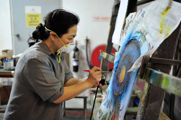
Having started her own glass studio, Synergraphic Design, in the late 1980s, when glass art was relatively unknown in Singapore, Ng was determined to learn more about the craft and glass fabrication techniques and treatments. It was this sense of determination that led Ng to travel to Seattle, USA, 30 years ago to study under American artists, Roger Nachman and Carmen. Studying under Nachman, Ng perfected the technical basics of glass making and began to experiment with the various techniques that she learned. Additionally, after visiting Dusseldorf in 1990, the artist brought back her first kiln to Singapore and started experimenting with glass fusing and kilnforming.

For Ng, growing and evolving as a studio meant keeping up with the latest trends and technological developments. As the company expanded over the years, Ng and her team began to develop ranges of standard glass products that often combined unique glass making techniques with artistic flair and creativity. LamiArt (glass laminated with various substrates) and SynAxo (glass with metallic finishes), as well as many others, became widely used among architects and interior designers, exemplifying the creative innovation of Ng and her team.

“What has always set our works apart was, firstly, our design. Secondly, it was the way that we mixed and matched our techniques and, thirdly, it was our attempts to continually find synergies between glass and other materials to create something wonderful and beautiful,” says Ng. “This is because while glass is in itself versatile, it is still limited as a material and often presents something extraordinary when combined with other materials such as stone, wood, acrylic, metal.”

Ng’s creativity and willingness to explore the possibilities of glass led to collaborations with other designers on works that demanded bespoke solutions, out-of-the-box ideas and technical expertise. While, initially, the works were limited to small, very intricate and detailed designs, Synergraphic Design eventually began to take on larger interior projects, looking at different ways of how glass art could harmonise with the surrounding environment, create an atmosphere and shape a space.

Despite the variations in scales and settings that have come with some of the bigger projects, Ng and her team’s approach of exploring different treatments and techniques for an impactful result has remained consistent throughout the years. “We always attempt to go beyond the two-dimensional drawings to bring the renderings to life in three-dimensional form, often employing multiple techniques to create those special finishes and effects,” Ng explains. “We always desire to create works of enduring beauty that wow the audiences.”

Today, Ng’s pursuit of innovation continues to lend her company a steady stream of creative projects for clients in Singapore and in the region. Synergraphic Design recently completed a sizeable commission, totalling close to 1,000 pieces with 24 designs, for illuminated wall artworks for a large hotel in Asia. The company also completed an installation of blown glass dragonflies and origami-style bees in collaboration with Ann Teo from COEN Design International for the recently concluded Singapore Garden Festival 2016 at Gardens by the Bay.

As for the future goals for her company, Ng hopes to continue sharing her passion for glass making through her projects and collaborations, bringing awareness to the versatile material that inspired her to start Synergraphic Design in the first place. She says, “I hope to produce unique designs in glass in synergy with other materials and art forms, distilled in furniture, lighting, and lifestyle accessories and perhaps even in fashion, that people will come to appreciate. I hope they will find that these works bring value to their lives and spaces.”

In companies Tags product design, florence ng, synergraphic
Comment
← Newer Posts Older Posts →

© olharomaniuk.com, 2014-2018
All Rights Reserved